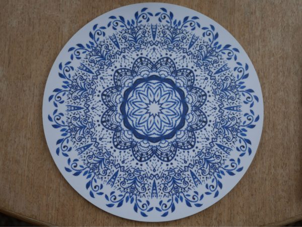
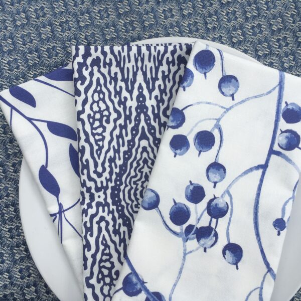
Classic Blue: Looking back at the Colour of the Year and taking steps forward into the New Year…
As we head towards the end of this year, a time that has been full of so much change and uncertainty, we take a final, celebratory look at the Pantone Colour of the Year for 2020.

Classic Blue, the ‘Colour of the Year’ for the Pantone Institute was a colour they selected to present the mood for 2020. How prescient was their colour choice for this year. Selected from more than a 1,000 colours in their spectrum, each with a specific name that follows the Pantone Matching System and with their own unique code, their system creates a ‘universal language’ for manufacturers and designers.
An intense colour, offering a sense of tranquility and contemplation and according to the Pantone Institute, symbolising ‘stability and calm’, a shade reminiscent of the sky at night.
‘Imprinted in our psyches as a restful color, PANTONE 19-4052 Classic Blue brings a sense of peace and tranquility to the human spirit, offering refuge. Aiding concentration and bringing laser-like clarity, PANTONE 19-4052 Classic Blue re-centers our thoughts. A reflective blue tone, Classic Blue fosters resilience.’ Pantone Institute
Classic Blue for many, reminds us of relaxed, easy pre-pandemic days of swimming in the sunshine…a feature in the sunny landscape of the idyllic swimming pool captured by British artist David Hockney.
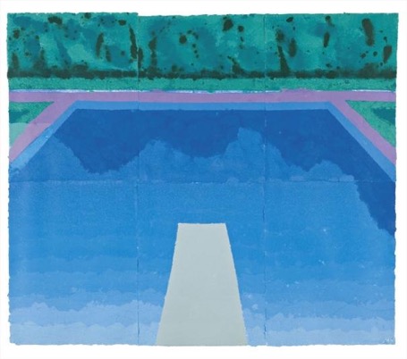
‘Autumn Pool (Paper Pool 29)’ by David Hockney, 1978. Colored and pressed paper pulp in six parts.
The artist painted various swimming pools, attached to his friends’ LA houses. His ‘Autumn Pool’ of 1978 depicts a swimming pool which engulfs nearly the entirety of the painting. The water in the pool is calm and unmoving. There are hints of the ‘Classic Blue’ colour reflected in the water, in the shadows cast by the hedges. Hockney has positioned the viewer on the diving board, inviting us to dive in and feel the refreshing coolness of the water.
‘A Bigger Splash’ by David Hockney, 1967. Acrylic
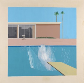
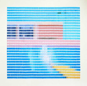
‘A Bigger Splash’ by Nick Smith, 2015. Screenprint in colours.
A London based artist called Nick Smith recreates various famous paintings, including Davinci’s ‘Mona Lisa’, Vermeer’s ‘Girl with a Pearl Earring’, and Hockney’s ‘A Bigger Splash’. He uses Pantone colour swatches, painstakingly selecting the appropriate shades seen in the above paintings. When we look at them, we can piece together the whole image mentally. For his recreation of Hockney’s work, Smith used 1,176 individual colour swatches. In this collage, we see the ‘Classic Blue’ shade in the windows of the single storey house.
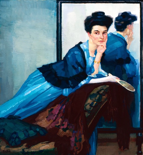
‘Lady in Blue’ by Leo Putz, 1908. Oil on canvas.
A painting that has long been associated with Classic Blue is the eye catching and elegant portrait, ‘Lady in Blue’ by German painter Leo Putz from 1908, a work almost entirely in blue. Putz, a relatively unknown artist, was loosely linked to the Impressionist movement and was also a pioneer of German Expressionism. There is little written about this work, wrapping it and the painter somewhat in mystery. In contrast to Hockney’s pool paintings, this portrait reminds us of the calm and intensity that blue can offer inside the home.
A woman rests her arm on a chaise longue, holding a mirror in one hand and resting her chin on the other. She wears a light sky blue dress, a dark blue shawl and the wall a turquoise shade, with shades reminiscent of the ‘Classic Blue’ in the texture of her shawl. There is a contemplative atmosphere due to her thoughtful gaze, which correlates with the description of the ‘Classic Blue’ as ‘bringing a sense of peace and tranquility’.
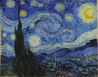
‘Starry Night’ by Van Gogh, 1889. Oil on canvas.
The choice of colour for this year reminds us, during tumultuous times, of the serenity and inspiration offered by the colour blue, found in the gentle ripples or stillness of a swimming pool, the interior of a room or in the expanse of a night sky.
The universal language of colour brings us together and we will continue to celebrate our love of blue and its calming and celebratory sense of unity in the years ahead. As you step forward into the New Year, we wish you the happiest and healthiest of times with your families, and for those for whom this year has been so difficult, we send you hope and courage for better days ahead…as they will surely come again…
